
Good design rarely announces itself. You don’t notice a well-designed menu, app, or poster — you just find it easy to use, easy to read, and easy to trust. Bad design, on the other hand, announces itself constantly: cluttered layouts, clashing colors, text you have to squint at. If you’re picking up graphic design, whether as a hobby, a side hustle, or a career, understanding why things work is far more valuable than memorizing software shortcuts.
Here’s a practical walk-through of the ideas that actually move the needle.
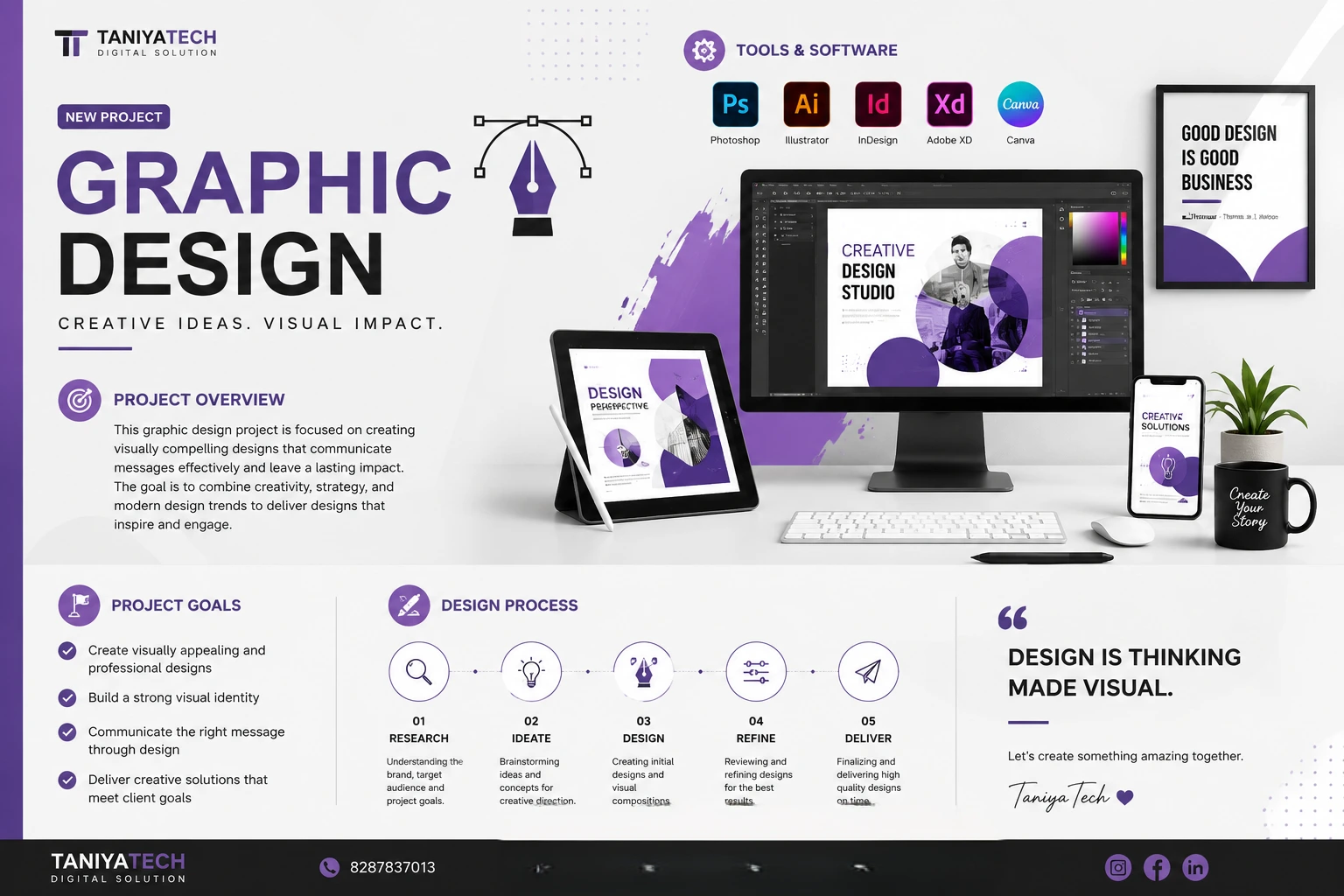
1. Design Is Problem-Solving, Not Decoration
The biggest mindset shift for anyone starting out is realizing that graphic design isn’t about making things “look nice.” It’s about communicating something specific to a specific audience. Before opening any design tool, ask:
- Who is this for?
- What’s the one thing they need to understand or feel?
- Where will they see it (a phone screen, a billboard, a business card)?
A flyer for a local bake sale and a pitch deck for investors solve completely different problems, even if both technically involve “layout and typography.” Skipping this step is why so much design ends up pretty but pointless.
2. Typography Carries More Weight Than People Think
Type isn’t just “the words.” It sets tone before anyone reads a single sentence. A few fundamentals:
- Pick two typefaces, max three. One for headings, one for body text. More than that and things start to feel chaotic.
- Contrast matters more than variety. Pair a bold sans-serif heading with a clean, readable serif or sans-serif body — the difference in weight and style creates hierarchy without needing five different fonts.
- Line length and spacing affect readability more than font choice. Long, cramped lines of text are exhausting to read regardless of how nice the typeface is. Aim for 45–75 characters per line for body copy.
3. Hierarchy Tells People Where to Look First
Every layout needs a clear order of importance. If everything is emphasized, nothing is. Designers create hierarchy through:
- Size — bigger elements read as more important
- Color and contrast — a bright color against a muted background pulls the eye
- Position — people scan in predictable patterns (often top-left to bottom-right, or in an F/Z shape)
- Whitespace — the empty space around an element makes it feel deliberate and important, not crowded
If you’re not sure where someone’s eye will land first on your design, that’s usually a sign your hierarchy needs work.
4. Color Is a Tool, Not a Feeling You Chase Randomly
Color choices should support the message, not just look appealing in isolation. A few starting points:
- Limit your palette. One dominant color, one or two supporting colors, and a neutral (like a soft gray or off-white) will take you further than five competing hues.
- Contrast is functional, not just aesthetic. Text needs enough contrast against its background to be legible — this matters for accessibility as much as style.
- Color carries cultural and emotional associations. Red can mean urgency or passion; blue often reads as trustworthy or calm. These associations shift by context and culture, so know your audience.
5. Grids and Alignment Create Order Out of Chaos
Nothing makes a design look amateur faster than inconsistent alignment. Using a grid — even a simple one — forces elements into a relationship with each other, which is what makes a layout feel intentional rather than scattered.
A simple rule: every element on the page should align with something else, even if it’s not obvious at first glance. Margins, columns, and consistent spacing between elements do a huge amount of invisible work.
6. Constraints Make You Better, Not Worse
New designers often think more tools, more effects, and more colors equal a better result. In practice, the opposite is usually true. Working within tight constraints — a two-color palette, one typeface, a fixed canvas size — forces creative problem-solving and usually produces cleaner, more confident work than an unlimited toolkit does.
7. Feedback and Iteration Aren’t Optional
First drafts are rarely the final version, and that’s normal. Getting comfortable sharing early work, hearing “this part isn’t working,” and revising accordingly is a core skill — arguably more important than any single design principle. The designers who improve fastest are the ones who treat critique as data, not as a verdict on their ability.
Getting Started
If you’re new to this, you don’t need every principle mastered before you start making things. Pick one project — a poster, a social media template, a simple logo — and apply just two or three of these ideas deliberately. Notice what changes. Then do it again with a different project. Design skill builds through repetition and reflection, not through absorbing theory alone.
The tools will keep changing. These fundamentals won’t.